Year in Review
As a 6th grade teacher, I often have my students engage in various reflection exercises. I think it helps us learn what we do well and just as importantly it helps us learn our areas of weakness. Reflecting on the past enables us to do the future better. So, as 2009 is coming to an end I thought it would be fitting to reflect a bit and post some of my favorite wedding images of the year. However, as I started going through them I realized a couple things: 1) There are way too many to post, and 2) there are certain techniques I use in my wedding photography over and over again.
So I decided not to show ALL of my favorite images, but to group some of my favorite images into meaningful categories which will give you a glimps of how I work on a wedding day.
Furthermore, I decided to take this time of refection one step further and not only write about techniques I use to capture images, but also techniques I use in post-production. My hope is that these next few days of reflection will help you learn how to appreciate the art of wedding photography.
Walking
I thought I would start today with a series of walking portraits. Often, during the bride and groom's portrait session I will just ask them ignore me and just walk away. Sometimes I stay where I am and capture different framings of them as they move away, and sometimes I'll run along just behind them capturing closer, more candid feeling moments. Then I ask them to just turn around and walk back toward me, getting similar shots as before except now instead of creating an objective, distant or symbolic image of a bride and groom, I'm creating a more personal, subjective portrait of Deanna and Tim, for example.
Deanna and Tim
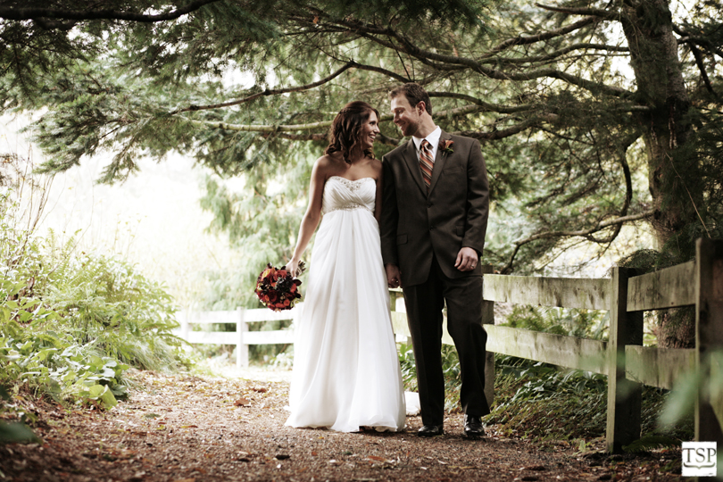
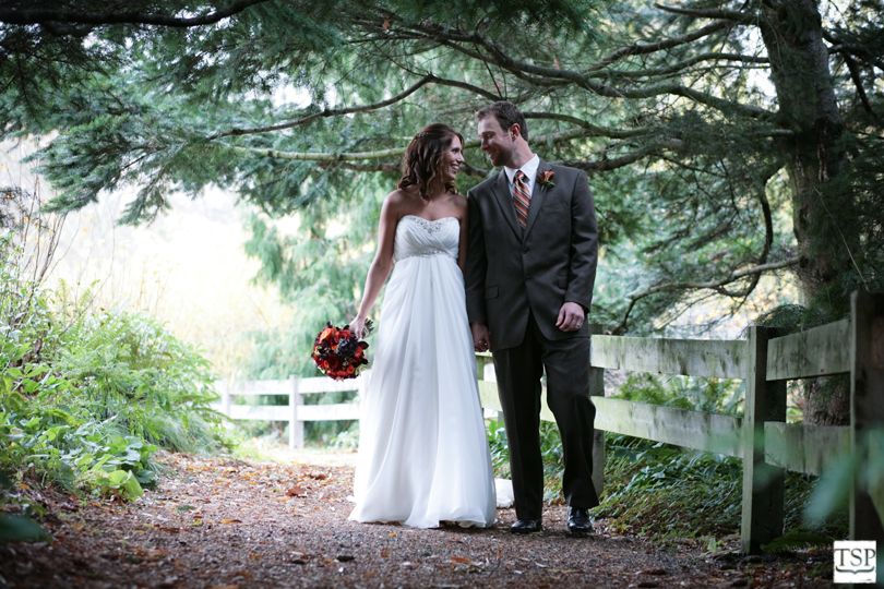
Here is a recently posted image of Deanna and Tim. It was a cold and wet day, so it isn't an accident that the are positioned under a tree. Also, since the ground was wet, we were worried about Deanna's dress, so if you look very carefully you can see a white table cloth behind her that we kept positioning under her. In fact, since Deanna couldn't really afford to drag her dress across the ground, for this picture I just told them to pretend to walk.
Now on to the post-production. Probably the most noticeable difference between the final (top) image and the proof (bottom) image is the color temperature. Neither is wrong or right, but as I was processing these images for the blog I decided to go warm instead of cool. Also, I played a bit with the saturation of the image to give it a more aged, timeless feel. Finally, in the final image I lightened the shadows on Tim's face. Not too much or it would look Photoshopped, but enough to catch some of his expression.
Kathryn and Dustin
Heather and Dave
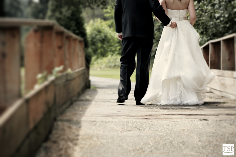
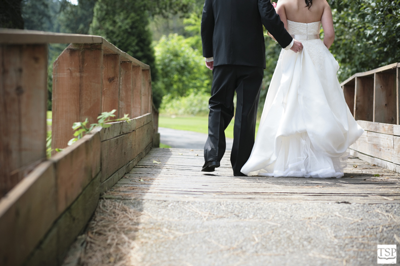
This next couple is Kathryn and Dustin. This was one of those instances where I told them to walk and I chased after them, intentionally cropping important information out of the frame in order to create a more striking, unexpected image. The most important difference here between the final image (top) and the proof image (bottom) is again the toning. Playing with mid-tones, laying a texture (that hopefully you didn't even notice was there), and otherwise leaving a good frame alone was what made this final image memorable.


Heather and Dave
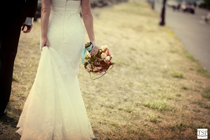
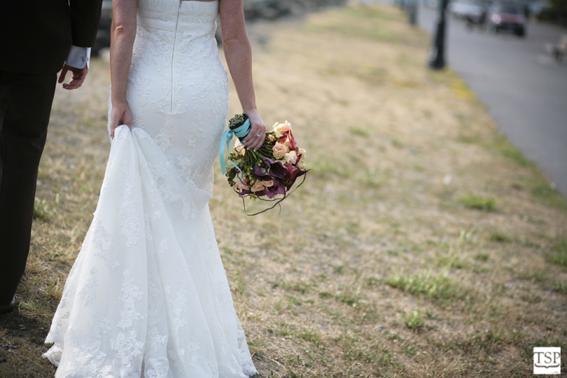
This time I asked Heather and Dave to walk away from me and I stayed where I was until they fell into the framing I had envisioned. I love it when the groom helps the bride with her dress because it isn't the kind of thing many people would intentionally include in a posed picture. So even though this is in fact a posed photograph, it appears candid because of that one unexpected element.
The post-processing on this image again has a unique toning. I try to process each wedding I shoot uniquely. Most of the time I'll try to pick up cues from the decor of the wedding, the dress, the venue, or sometimes I'll just pick a style that feels right.
Other than toning, my primary focus for this image was drawing the eye to Dave's hand. To do this I 1) darkened the other areas of the photo and lightened the area around couple (hopefully subtly enough you can't notice), and 2) I blurred the bridge. I didn't think it was a particularly nice bridge anyway, so and I was happy to have the idea of a bridge without the actual details of this bridge.


Natalie and Sean
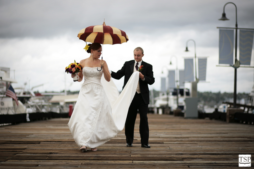
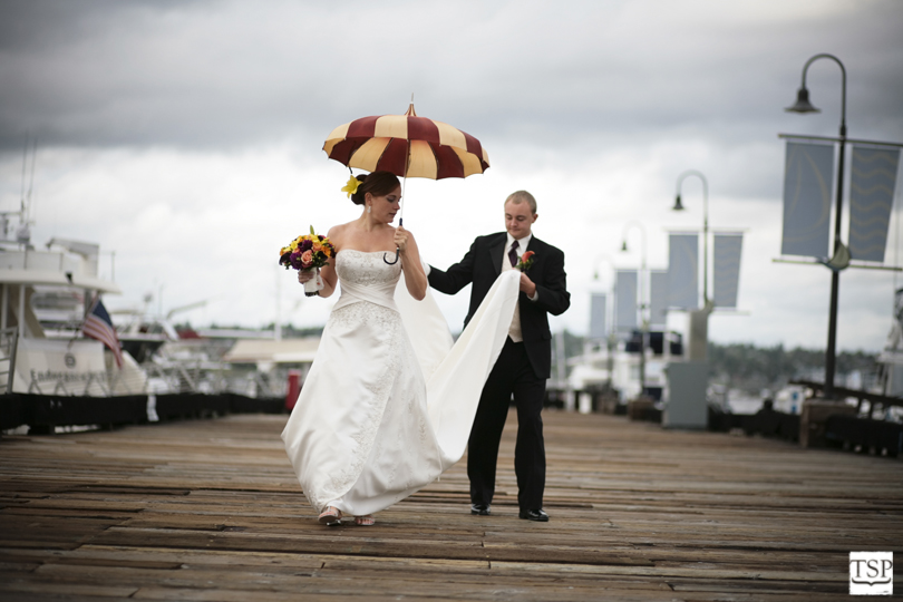
This final walking picture was taken after Natalie and Sean thought they were done posing. In fact, they were done posing and that is what brings this image to life. As far as post production goes, I straightened the horizon and played with the contrast a bit on the final image (top), but mostly just left it alone. Sometimes the best thing you can do in Photoshop is nothing.

That was a really well done post; I very much enjoyed reading it. I'm looking forward to more of your review!!
ReplyDeleteVery interesting post, Taylor!
ReplyDeleteThanks Anne Marie and Brian. It's definitely wordier than my normal posts, but it's fun.
ReplyDelete