
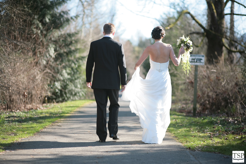
In this first set of images the final version of the image is on top. The aspect of this image that really caught my eye was the shape of Sarah's dress as she holds it up. As soon as I saw that shape, I knew this was going to be brought to the final image stage.
In the final version, you'll notice I cropped in a bit closer to Sarah and Justin to get them a little more centered in the frame and to cut out some unnecessary information. You'll also notice I removed the distracting sign on Sarah's right. Finally, I changed the toning a bit to give the image a more unique feel, and blurred the edges a little to draw the eye towards Sarah and Justin and to give the image a more aged, imperfect feel.

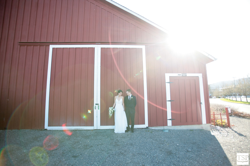
Images which use full sun as back-lighting can offer a very distinctive look, but they are also a bit of a craps shoot. You never know exactly what kind of flare and aberrations you'll get when you let the sun straight into your lens. I love it.
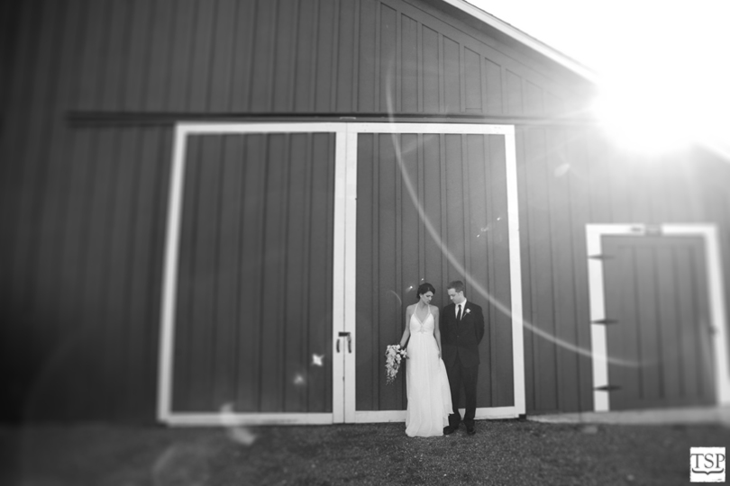
Obviously, the final version of this image was converted to black and white. I tried to make it work in color for a while, but finally decided it just looked better - more subtle - in black and white. Again, I cropped in closer to Sarah and Justin to remove the distracting and modern street details, and I added a tilt/shift lens effect to add visual interest and draw the eye to our couple. I also thought the extra blur again added a vintage feeling to the image.
burberry outlet
ReplyDeleteuggs outlet
discount ugg boots
kd 6
uggs outlet online
woolrich outlet
nike roshe run
canada goose jackets sale
nike store
cheap ugg boots
ugg boots on sale
moncler jackets
mcm bags
ugg boots sale uk
cheap uggs uk
uggs outlet
cheap ugg boots
ugg boots uk
jordan shoes
uggs clearance
ugg outlet
marc jacobs outlet
ugg boots clearance
uggs outlet online
ugg boots sale
cheap oakley sunglasses
guess outlet
uggs on sale
canada goose jackets
ugg boots sale
uggs for sale
ugg boots uk
uggs black friday
new balance shoes
cheap uggs
ugg boots cheap
patagonia outlet store
dolce gabbana handbags
air max 2014
ReplyDeleteparajumpers outlet
ugg outlet store
louis vuitton outlet online
miu miu handbags
ugg sale
uggs on sale uk
ugg boots clearance outlet
yves saint laurent shoes
cheap ugg boots
ugg clearance
ugg black friday
ugg clearance
ugg boots clearance sale
uggs sale
ugg sale
mulberry bags
ugg boots clearance
uggs outlet
cheap uggs uk
nike air max
discount uggs
discount uggs
cheap nike basketball shoes
ugg outlet
michael kors uk
cheap uggs on sale
ugg uk
ugg outlet online
uggs on sale
tiffany & co
genuine uggs